At Tupaia, we understand that visualising data can help in both understanding your problems and developing rapid and effective solutions to them. We know that the more information that is available to you, the more effective Tupaia will be for you. We also know that data that is hard to interpret or misleading can worsen decision making and exacerbate challenges.
This is why we’re excited to announce that we’ve added four new visualisation features to Tupaia! These features open up new possibilities, make information easier to consume and allow you to more easily draw on larger data sets to understand your projects and systems.
Date selectors across the site:
Date selectors are now available across all dashboard visualisations. This gives you greater levels of detail about problems, helps you to understand different dimensions of your information and allow you to quickly spot trends. As an example, if you want wanted to see how many COVID cases a particular Australian region had over the last six weeks, you can expand the case numbers chart and flip through to see previous data. If you want to see how medicines availability compares to the same time last year, you can use the same tools. This feature is yet another way for you to track and compare statistics over time, giving you better context for current data.
All map overlays are also now time-stamped to show when the data you are looking at has been generated.

Date Selection feature example
Weather API
We’ve also added in a weather API – which means we can now pull in rainfall data in real
time. This is a powerful feature to support our work on both environmental health projects and Emergency Operations Centres. Whilst traditional data sources, such as Logistics Management Information Systems and field-based surveys remain central to our platform, we aim to give you the most complete picture possible and adding in up-to-date weather information is a key part of this puzzle.
The weather API is made possible by our improved ‘data broker’ which can consume data via APIs from a variety of sources and process it into our system far more easily than we’ve ever done before.
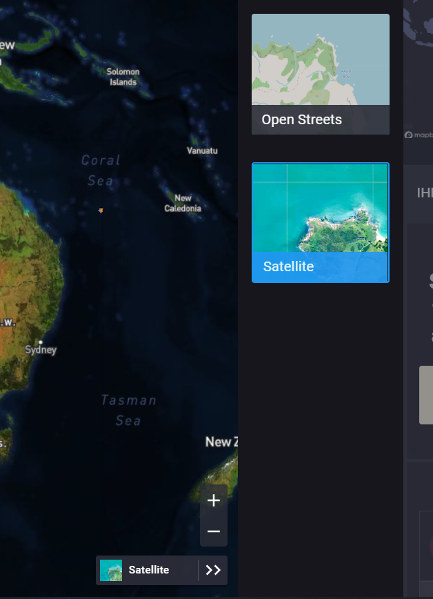
Map tile selector
Tupaia has always supported multiple mapping tiles, allowing users to toggle between Mapbox and OpenStreetMaps (depending on the bandwidth available and necessary map features). We’ve now taken that a step further with our intuitive map tile selector, which makes it easier for you to toggle between a wider range of mapping tiles (which provide the imagery you can see underneath our own visualisations). This allows us to add in more options, like topography and water catchment layers and tailor them more specifically to certain projects. By allowing you to visualise the maps in the way that suits your context, Tupaia can better help you to better understand how your data relates to the world around it.

Map tile options
Regional data views
Finally, we’ve added in regional data views. Previously, it could be difficult to assess the impact of your programs across the Pacific region, as most information was only available on one country at a time and it was difficult for countries to present regional information clearly. We have addressed that with this new ‘regional data views’ feature, which offers a broader overall picture by allowing you to view program data across multiple countries in real time. It also extends on our work supporting multiple data hierarchies within and between projects.
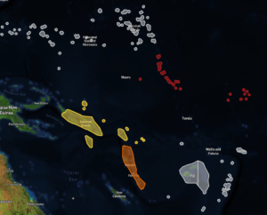 Regional Data views
There are a tonne of other new features we’ve launched in 2020, both for specific projects and under the hood, such as improving the speed and scalability of the platform.
We have been working tirelessly on these features and are thrilled to be able to share some of them with you. We look forward to continually working alongside you, seeing how these features help you to achieve success in your programs. Feel free to get in touch with us any time to share your thoughts on these features!